The Importance Of Having A Logo For Your Company.
The Importance Of Having A Logo For Your Company.: It's shocking how many new businesses launch without a logo or brand. Many people mention a lack of funds or time as an excuse, yet this is a common blunder.
What exactly is logo design, and why is it so important?
So, what does it take to create a memorable brand? This essay will discuss your brand, which is quite important. Your brand is the visual image of your company, and it is the first thing a customer sees whether they visit your website, online store, or physical store. Branding is important, and when creating a logo, you should take the time and attention necessary to guarantee that it is done right. Many factors should be addressed while developing a distinctive logo and brand. When choosing the most appealing logo for your firm, keep certain aspects in mind. In this post, we'll discuss the best approach to take when creating a killer logo and brand, as well as some critical factors to consider when deciding on the best logo for your individual demands and objectives. Everything matters, whether it's the colour, the typeface, or the icon. Take your time while designing your logo because it will be used to sell your products and services for many years to come. It should not take you five minutes to create a logo that will be remembered for the rest of your life. Once your logo and branding have been established as your company's visual connection, changing them in the future will be difficult, if not impossible. Keeping this in mind will make it easier to select an appealing, easily legible, and timeless design for your logo. So, to begin, let me explain the process of creating a brand that may catapult you and your organisation to the next level of success.
Create a logo that makes an excellent first impression

So, what is the goal of creating a memorable brand logo, and why is it so important? When it comes to visual perception, we do judge a book by its cover, and we are naturally curious creatures. The initial trigger is always something aesthetically appealing, whether it's the box of the latest toy when you're a youngster or looking for someone to take on a hot date when you're in your twenties. The same rules apply when it comes to developing a brand. Creating an appealing plan is the most effective way to engage a potential consumer. A logo is a marketing tool that should capture the attention of the viewer right away. The design of your logo will be decided by the products you are marketing. Each industry will have colours and a style that are more appropriate for your specific area or industry. A logo for a children's nursery, for example, would not be designed in the same way as a logo for a restaurant chain.
First impressions are crucial.
 How does one go about creating a logo, and hence a visual identity? A logo is much more than a text tag and an aesthetically appealing icon. Is there a logo that you've seen and immediately felt drawn to? When we first see a logo, we experience something similar to this. When we first view a logo, the receptors in our eyes provide information to our brain, which analyses the logo's appearance and feel. This recognition occurs in a fraction of a second, and your brain registers an emotional response to what it sees nearly shortly after. Depending on the reaction, the individual getting the answer may experience sentiments of happiness, warmth, kindness, or anxiety.
the eye's symbol
When we look at a brand, our eyes develop an emotional response.
The way we feel is the outcome of our brain's reaction to environmental cues. The process of creating a logo tells more about a firm than we know. Our brain is a magnificent and powerful structure, but we only use 10% of its capacity. Because the human brain is the most complex structure known in the known universe, it functions as our internal supercomputer, which has evolved over millions of years. The human brain requires a lot of energy to function, eating 300 calories each day and producing enough electricity to power a low-wattage light bulb. Our brains are lightning-fast, with waves of electricity travelling at the speed of light through our bodies to reach our neurons. To elicit a response, our eyes send signals to our brains that are nearly immediate in their response time. Throughout history, humans have been able to live and avoid danger due to our capacity to react fast. The process of decoding the visual begins almost immediately when the eye is exposed to light from a picture. That is, everything that happens in less than a blink of an eye is amazing, as is the speed with which it happens.
Response to forms, colours, and typefaces on the visual level
Understanding how our brain and eyes work together to generate an emotional response from us when we view a logo is crucial. Our senses help us navigate the emotional world, and what we perceive reflects how we are feeling at the time. Tones like red, yellow, and orange elicit sentiments of warmth and comfort, whereas blue tones evoke feelings of cold, quiet, and non-threatening. Distinct font styles create different emotions in the viewer. You can express a sense of quality and respectability by employing a serif font, whereas rounded typefaces can convey a sense of fun and lightheartedness. The script style of typography, on the other hand, inspires feelings of elegance and femininity in the reader. The viewer's emotional responses will vary depending on the form. Circles convey a sense of wholeness and harmony in the spectator, whereas squares signify solidity. We associate diagonal lines with motion or movement when we run with our faces slightly forward, and we develop a connection to the horizon when we run with our faces slightly forward. A vertical line, on the other hand, might suggest a sense of structure, as trees and buildings stand tall and straight in the environment. A semi-circle can depict the view of a grin, grief, a rainbow, or sunrise in various ways, depending on how it is used.
Create a visually appealing logo
When a new customer sees your brand for the first time, they should be able to look away and draw a basic blueprint of what they have just seen.
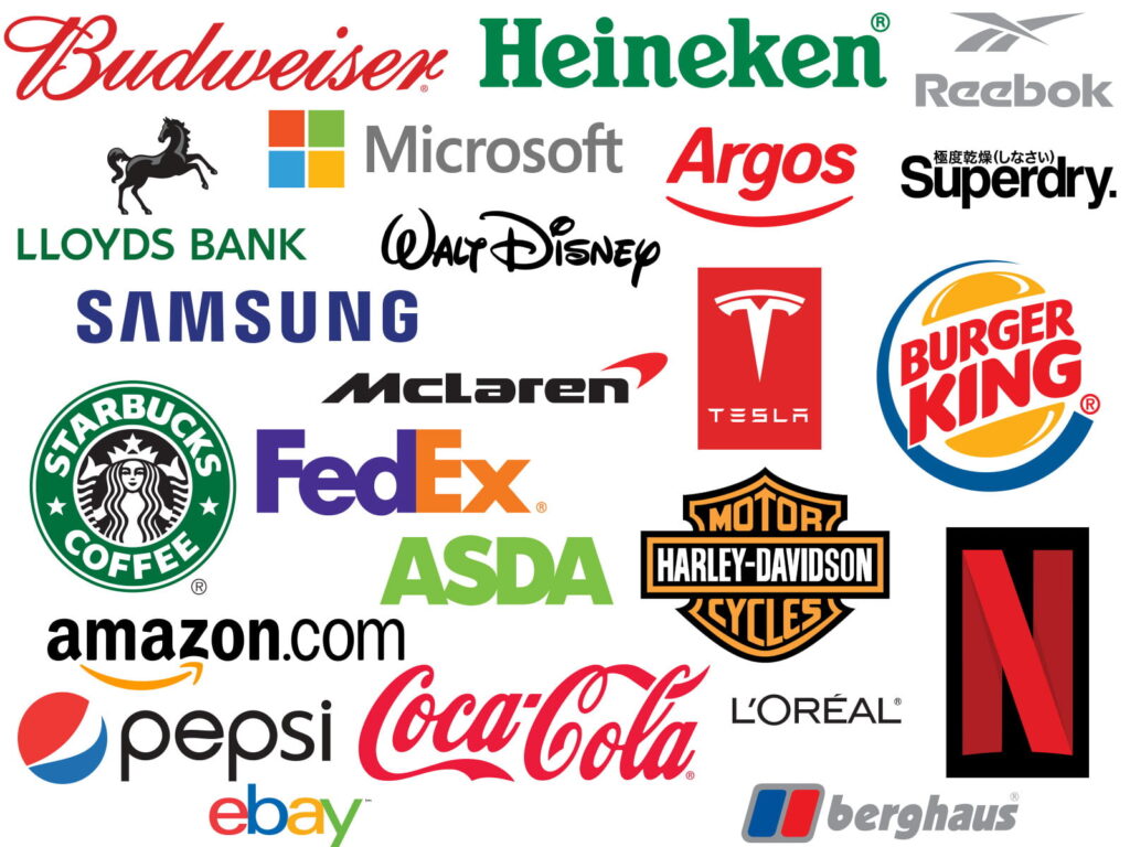
The most effective logos are those that immediately capture the viewer's attention and elicit curiosity. Logos should entice customers to investigate the brand or product further in order to develop interest in what you're selling. Only a small percentage of memorable logos include a reference to the product in the name or emblem. You might be thinking, “Wait a minute, that's not right,” and some logos, such as Pets at Home, Carpet World, and so on, do have a link. The majority of the main players' logos give no hint of what they sell. It's remarkable to think that if you hadn't seen some of the world's most known logos previously, you'd have no idea what that company was selling. The following is a list of companies whose logos do not appear to be related with any specific product or service.
![]()
Recognition
What makes this so remarkable is that when we see big-name firms, we quickly know them. When you see the Apple logo, your brain automatically connects the dots, implying that a good logo should be memorable and simple to remember. Because most businesses start with a limited budget before creating a well-known icon or logo that is instantly identifiable, it is vital to consider integrating a description of what you are offering. In Apple's case, the company was founded as Apple Computers Inc., which explains the product. They have grown through time to become one of the world's largest firms, today is known as Apple. Apple has grown to such a size that it no longer needs to explain its products.
You never know when you might be establishing the next Amazon or McDonald's, so when developing your brand, bear in mind how your logo might evolve in the future.
Create a brand that will last a lifetime
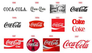
There's more to creating a timeless brand than meets the eye at first look. It is usual for major, well-known firms to rebrand on a regular basis. However, the changes are small, resulting in a logo that, even in its facelifted form, has a striking similarity to the original. It is vital to maintain a strong connection with the previous brand, and this tie must be clearly demonstrated to prevent misleading returning customers. You should choose a logo that has the ability to evolve. Consider how you will adjust your logo in the future to keep it looking current and relevant when selecting a logo and brand. The evolution of the renowned Coca-Cola logo, demonstrates how it has evolved over time to become the logo you see today.
The fundamentals of designing a logo
Your logo may be used to identify you and your company, which helps both new and returning customers recognise you. Your logo must attract the viewer's attention and be easily recognisable within two seconds. The type of your business, as well as the service or product you are selling, will influence how you choose your ideal logo or brand. Your logo should be easy to read, understand, and pronounce. It is impossible to overestimate the value of simplicity. If you want to utilise a symbol in conjunction with your logo, keep it basic and easy to notice. Another important element to consider is how your logo will be reproduced. Colours that can be easily copied are required for CMYK to work properly.
Colors
We already emphasised how crucial it is to select colours that symbolise your product and services. A colour palette is essential to the success of any design endeavour. Even when it comes to colour, less is more, as proven by the fact that many renowned logos use only one or two colours in the majority of instances. When you think of eBay, you naturally think of their multicoloured logo, despite the fact that their logo is only four colours.
So you've chosen an eye-catching colour scheme, but how does it perform in practice? Because CMYK is the industry-standard print colour process, your logo must look great when printed in normal CMYK colours in order to be successful. Hiring a designer will guarantee that your logo is legible and looks great in CMYK colour mode. When converting a file created in RGB (screen colours) to CMYK, the colours can appear dull and washed out. When it comes to colour consistency, selecting a Pantone colour is an excellent choice. Pantone is a well-known colour matching system in the printing business that allows print companies to match colours from a physical colour chart booklet. Once again, when choosing a Pantone colour, make sure that it reproduces well in CMYK format. If you are unsure, seek advice from a local print shop. It is also critical to consider how your logo will be presented, whether on a car livery, a printed PVC banner, a display, or a printed Gazebo, among other things.

Vibrancy
The identity and logo of a brand should be appealing and interesting. Bright, eye-catching hues are always well-received, and they are used more often than softer, lighter variations of the same colour. The use of vibrant and brilliant hues will give a sense of movement and vigour. For obvious reasons, there are only a few well-known logos developed in the colour brown. It should be emphasised that there are several exceptions to the rule, the most common of which are coffee shops and chocolate factories. It is critical to add vibrancy into the design of a logo that is full of energy and vitality. Even if you like softer, less vibrant hues, you can still create a dynamic brand in terms of design.
Proportions of the Logo
The proportions of your logo are pretty significant and should be carefully considered during the design process. You don’t want a logo that is too deep in height or too long and thin at the same time. Examine the logos of other well-known companies to obtain a sense of the logo’s proportions. Choosing a logo with well-balanced proportions will make it much easier at a later point when ordering products such as printed banners or producing a design for car livery since the logo will fit better in the available space.
The scale of a logo
When developing a logo, it is also critical to consider the logo's size. When creating a logo or employing a designer, ensure sure it can be scaled to fit any size area available on the screen. It is strongly advised that you build your logo in vector format so that you can scale it to any size without distortion. Web designers frequently create logos with pixel-based software like as Photoshop; nevertheless, this should be avoided at all costs. If a designer tells you that this is correct, choose another designer. Alternatively, for more information on vectors, see this article on the benefits of using vector graphics:
Consistency is essential
Maintaining the integrity of your brand requires consistency. It's a good idea to make a simple brand guidelines library that illustrates your logo in numerous circumstances. A brand guideline is a set of visual cues that indicate how your logo should appear across various marketing platforms. It is a useful tool for keeping your branding in order at home. You can add a page with the colours you've chosen as well as Pantone references. It should include a section with your logos and symbols. It is not unusual for a logo to be available in multiple variations, such as two or more. The symbol can be placed above the phrase. Another possibility is to position the logo to the left of the phrases. Always remember to make a monochromatic version of the logos in either black and white or greyscale. A simple black and white version might be useful when adding to corporate agreements, contracts, and terms and conditions. It's a good idea to add a part in your branding guidelines on what to do and what not to do when building brand standards. Use a checkmark to indicate proper logo usage and a red X to indicate improper logo usage. The use of correct and incorrect examples shows how your logo should be utilised. You may ensure that future subcontractors who create artwork on your behalf have clear instructions on how to represent your company's identity by giving specific guidance in your guidelines.

Getting started with the process of developing a recognizable brand
After reading this blog, you should have a good idea of what you need to think about before starting the process of creating a logo for your business. Rather than writing from the perspective of a designer, this essay is meant to provide information to anyone wishing to develop a successful and identifiable brand identity for their business. Hopefully, at this point, you've decided to hire a graphic designer and have a better knowledge of what it takes to develop an easily recognisable brand.
Working with a Graphic Designer can be challenging.
A graphic designer would most likely have a distinct style that sets them apart from others. If you disagree with their proposed design, it's not uncommon for them to try to persuade you to reconsider and embrace their recommendations instead. Should you rely on the recommendations of your graphic designer? However, based on past experience, I trust my intuition and, if the proposal does not match my expectations, I will take the time to communicate my concerns and seek an alternative design entirely.
Why do graphic designers try to sway your decision? First and foremost, it's an easy day at work, and the sooner a designer can get you to sign off, the more money they make. Second, designing logo concepts takes time; consequently, they may be short on time. Finally, they've come up with a design that's all their own. When it comes to design, it's always a question of opinion because your designer has interpreted your brief in a specific way and has an emotional attachment to their creation.
Communication is important to everything.
If you do not like the design, you should express your concerns and provide feedback or suggestions to help the designer improve it. You can even change the brief to find a compromise, or you can rewrite it entirely. When delivering feedback to your designer, avoid using terms like “I'm not feeling it,” “Can you jazz it up just a touch,” or “I don't know what I want,” and, finally, “You're the expert.” Keep in mind that a designer is an expert in producing designs but not in your specific sector. You, not the designer, are in command of all information and direction regarding how the end result should look and read. You have the right to be critical, but you also need to be constructive. You will not be able to create your ideal logo until you obtain constructive feedback and coaching.
Why Is A Logo So Important For Your Business?
 An effective logo allows clients and prospects to recognise your company right away. It should be used on your website, emails, letterheads, business cards, flyers, advertisements, clothing, and signage, among other things.
When your company is properly branded, it will appear more professional than its competitors. This, in and of itself, helps to generate additional inquiries and business. Imagine one day noticing a basic white van parked outside a neighbour's house. You have no idea who owns the van or what services they may offer. However, if the vehicle is tagged with a Plumbing Company logo and contact information, you will not be perplexed.
Even for a one-man-band local tradesman, a logo and simple branding are essential.
The Article The Importance Of A Logo For Your Business First Appeared ON
: https://idtweb.org
The post The Importance Of Having A Logo For Your Company. appeared first on https://gqcentral.co.uk

